
2013 marked the driest year on record in most regions of California. While this weather pattern led to many brown lawns and thirsty reservoirs, clear skies allowed many locations to experience well above-average PV energy generation potential.
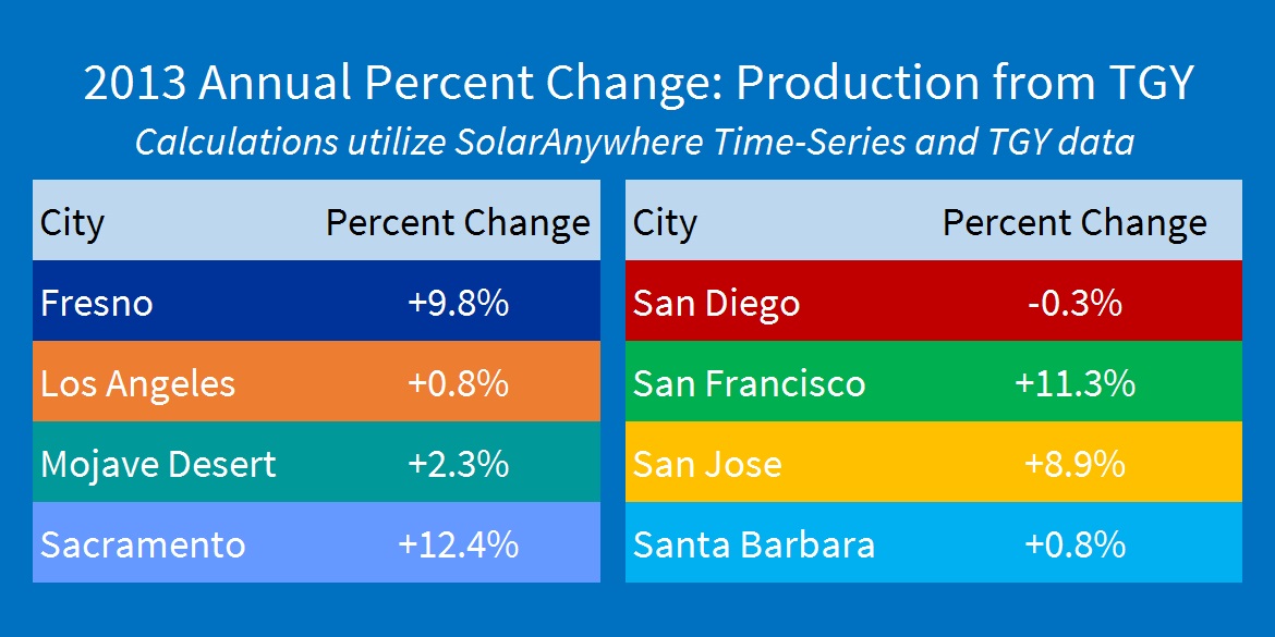
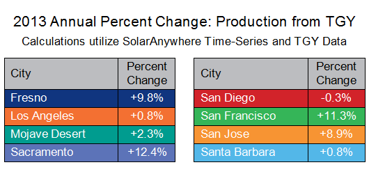
To better understand just how great the solar energy potential in California was in 2013, we compared month-on-month variance in PV energy production from long-term average conditions in eight locations. These included Fresno, Los Angeles, Sacramento, San Diego, San Francisco, San Jose and Santa Barbara, as well as the Mojave Desert, as there are a large number of utility scale PV sites being developed there.
In 2013, a persistent offshore high pressure system allowed most of California to experience below-average rainfall and above-average temperatures. Most cities saw enhanced PV energy generation potential in January, February, November and December due to the blocking of the typical Pacific storm track. This predominant weather blocking pattern, however, did not uniformly translate into an across-the-board increase in potential PV energy resource throughout California. Regional micro-climates responded differently to the enhanced drought conditions.
For example, coastal regions of California experienced below-average PV energy potential in the summer months due to enhanced marine layer stratus conditions. Meanwhile, drier than average conditions in California’s Central Valley dampened formation of Tule fog, enhancing the region’s PV energy generation potential. Additionally, above average North American Monsoon conditions decreased PV energy potential in the inland desert regions during July and August.
As the charts below show, there can be significant month-on-month variance with respect to long-term monthly PV average production. At the monthly level, we see departures of -10% to +50% at single locations.
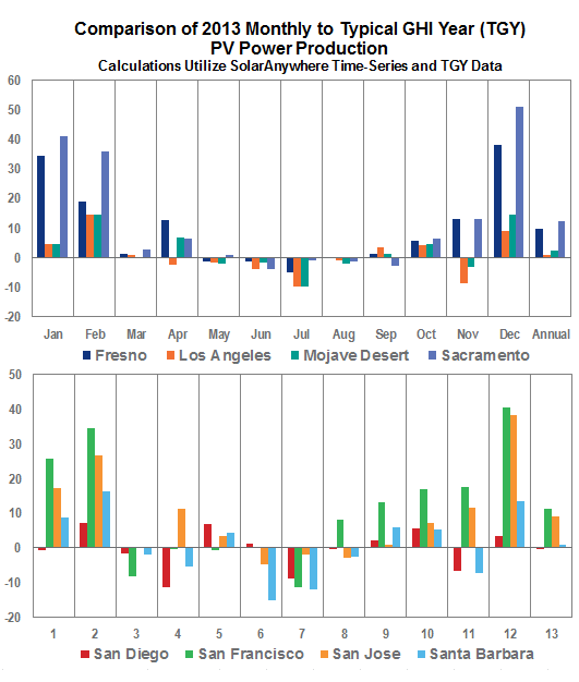
When viewed at an annual level, observed monthly variances decrease significantly, ranging from near normal for coastal locations, to increases of more than 10% in potential energy generation at inland locations.
These figures are based solely on Typical Global Horizontal Irradiance (GHI) Year (TGY) data that use mean monthly GHI values as opposed to irradiance plus weather weighted months chosen in the Typical Meteorological Year (TMY) process. The SolarAnywhere® Data historical dataset is available in both 10 km and 1 km resolutions, to help interested parties get the most accurate PV energy estimations possible, even in micro-climates.
Calculating PV production potential in your area
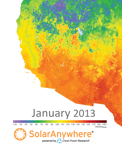
You can estimate what the output of a solar system might be in your area for any given month by looking at our PV Power Maps. Simply pinpoint your location on the map, refer to the color chart to determine that month’s PV power output, and multiply that number by the kW value of your system.
The PV Power Maps are created from power production data generated using SolarAnywhere irradiance data and simulation services. The maps depict the amount of electricity that could have been generated by a nominal 1-kilowatt (kW) photovoltaic (PV) system on a monthly basis. You can learn more about the maps and how to use them in the article, ‘PV Power Maps: visualizing monthly production.’
PV Power Maps of the United States are also available at the Solar Today blog.