

As we discussed in an article last month, it’s no secret that solar power generation can vary from season-to-season based on local weather conditions. So given this variability, how do PV system owners—whether residential, third-party, commercial or utility-scale owners—put a value on their investment?
The answer lies in the ability to look at longer time-horizons to understand anticipated variability, and thereby reduce solar risk, over the life of the PV system, which is typically 20 years or more.
Understanding variability
The chart below illustrates the impact of variability on monthly production. It compares the estimated monthly PV energy production at two locations—Flagstaff, Ariz., and Austin, Texas—to the average March PV energy production from 1998 to 2012.
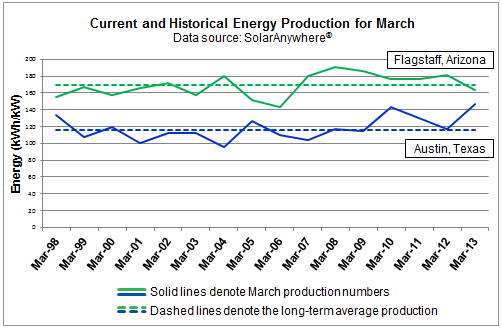
As can be seen in the figure, the monthly production at any particular location can vary as much as +/- 10 to 20 percent from the long-term monthly average. While month-to-month variability can be high, PV system owners can take comfort in the knowledge that annual production variability is generally significantly less at most U.S. locations.
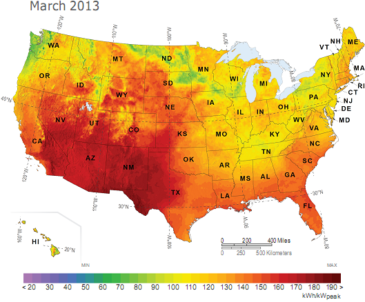
The March PV Power Map, as seen in the July/August issue of Solar Today, also gives us some insight into spatial variability. In March, above-average solar energy production was experienced through most of the South as drier-than-average conditions prevailed. Meanwhile, the Northeast and Great Lakes regions experienced lower-than-average energy production due to cooler and wetter weather effects.
Taking the long view to reduce risk
Because monthly PV production variability can be so high, using production figures for a single month is not a good basis for making an investment decision. However, most locations experience less than 5 percent year-to-year variability when looked at on an annual basis. Therefore, using long-term historical PV energy production estimates derived from tools such as SolarAnywhere® can significantly reduce risk by providing insight into projected monthly and annual production variability.
PV Power Maps
The Solar Today PV Power Maps are created from power production data generated by Clean Power Research using SolarAnywhere irradiance data and simulation services, and rendered by GeoModel Solar. The maps depict the amount of electricity that could have been generated by a nominal 1-kilowatt (kW) photovoltaic (PV) system on a monthly basis. You can learn more about the maps and how to use them in the article, ‘PV Power Maps: visualizing monthly production.’
The March map is featured in the July/August 2013 issue of Solar Today (see page 8). PV Power Maps from September 2011 forward are available at the Solar Today blog , or in Resources on the Clean Power Research website.