
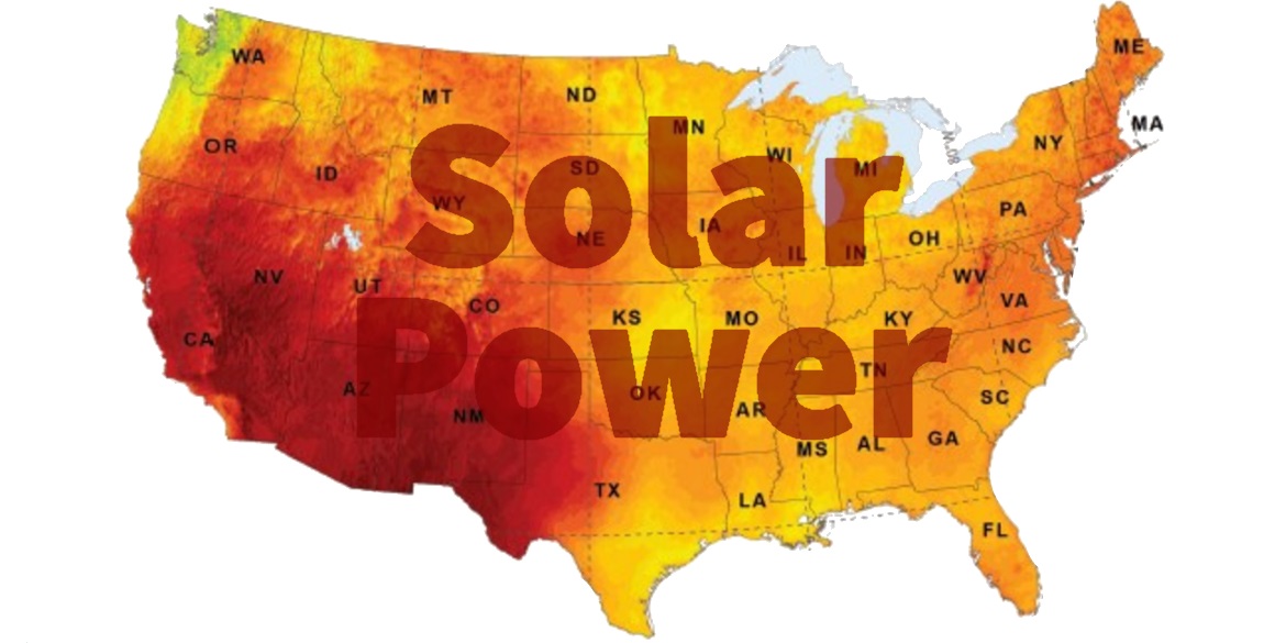
Determining whether solar is right for you depends in large part on the amount of solar resource available where you live. Each month, we generate the PV Power Map using SolarAnywhere® irradiance data. These maps provide more than just an indication of the solar resource across the U.S., however. They also provide power production estimates based on a nominal 1-kilowatt (kW) photovoltaic (PV) system by location. This distinction is important, as translating available solar resource to actual power produced is a complex computation requiring multiple inputs.
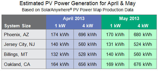
These snapshots are great tools for benchmarking production of an existing PV system for a particular month. They can also provide a strong indicator of expected production for planned PV systems, as long as a year or more of data is analyzed to take into account month-to-month variability due to seasonal changes and other factors.
The April and May PV Power Maps illustrate this variability, as several regions had noticeable monthly swings in PV energy production.
- In the Southwest, above-average PV energy production prevailed during both April and May, as drought conditions continued in the region.
- In the Northeast, PV energy production was above average during April, but slipped to average production conditions in May due to increased storminess.
- In the upper central U.S., PV energy production dipped in April due to wetter than average conditions, but bounced back to near-normal production in May.
- In the coastal and central valley regions of California, the effects of both the coastal stratus and inland valley clouds eased from April to May.
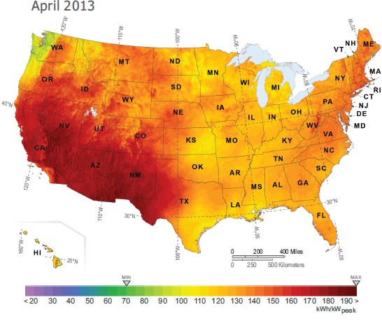
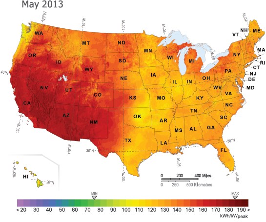
As illustrated in the chart below, the PV Power Map makes it easy to estimate what the output of a solar system might be in your area for any given month. Simply pinpoint your location on the map, refer to the color chart to determine that month’s PV power output, and multiply that number by the kW value of your system.
To gauge potential power output over time, you can access maps going back nearly two years at the Solar Today blog, or in Resources on the Clean Power Research website. You can also access historical solar resource data for specific locations, free of charge, at www.solaranywhere.com.
About PV Power Maps
The April and May maps are featured in the September/October 2013 issue of Solar Today (see page 8). The Solar Today PV Power Maps are created from power production data generated by Clean Power Research using SolarAnywhere irradiance data and simulation services, and rendered by GeoModel Solar. The maps depict the amount of electricity that could have been generated by a nominal 1-kilowatt (kW) photovoltaic (PV) system on a monthly basis. You can learn more about the maps and how to use them in the article, ‘PV Power Maps: visualizing monthly production.’